
DOWNLOAD THE APP


Customer Services
Copyright © 2025 Desertcart Holdings Limited
DOWNLOAD THE APP

Full description not available
M**S
My favorite deck ever!
Before buying these cards I actually had a friend that used them so I was able to see them first hand. I never was sure if I really wanted to buy them, but eventually a few months later I did. After having these for a while I've come to the conclusion that this is probably going to be my deck for a long time. Every thing about it I like.For starters the quality of the cards are good. Unfortunately nowadays companies have been producing decks with this flimsy paper that for some reason just gets damaged way to easily. The paper stock of these cards are what they should be in a tarot deck. I've have them for a while and they don't get damaged easily, they are very easy to shuffle, and they look well made.Secondly I love the art for the cards. I love how the artist threw in some Egyptian influence along with the colors that really go well with each other. Something I rather enjoyed is the fact that the deck is really reminiscent of the Rider Waite Tarot, but it still has it's own flare. I think the creator really took into account the basic tarot system because many decks I've seen lately tend to appear random. When I look at these cards I understand what the artist was going with.At the end of the day I feel that this is a truly unique deck that I think anyone who likes tarot should try. The theme is subtle which makes it usable by anyone with any interest or style and it's well made so any reader will have that as a plus. The only thing I didn't like was that on the back there is some small lettering which is annoying at first since I do readings with reverse cards, but after awhile I ignored it.
S**Y
Miss print
Came completely off print. Off kilter. Too late to return, wanted to do a unboxing video. What a bust. Such a disappointment.
T**S
I love it, but....
This deck is beautifully crafted and painstakingly illustrated, and I absolutely love using it-- for the most part. My favourite cards include the 9 of Pentacles (a skinny redhead with drastic makeup in leather pants with a falcon? Rock on.), the 10 of Swords and Strength. I love the unabashed sexiness of the Moon card, the mild paranoia of the 4 of Pentacles and the chauvinistic pride in the Chariot. I like that the deck doesn't shy away from heaviness or depression, and the details are incredible.However, there are a few cards I have some problems with.I'm sorry, but the gentleman in the 5 of Cups looks like he's giving a urine specimen, not mourning an emotional loss. In the 8 of Wands, the wands are all falling, not flying-- they're angled downwards, earthbound and failing. (In fact, I usually read this card from this deck as success and high hopes only when it appears reversed in my spreads, rather than upright.) Temperance looks more like a stoned hooker than a recovering addict, and honestly the Knight of Cups has the goofiest hat I've ever seen.The BIGGEST problem I have with my copy of this deck, though, is that you CAN in fact tell when a card is reversed or upright, just looking at the back. The "2006 USGAMES" logo is on the bottom right when the card falls upright, and the top left when it is reversed. I try not to look at it, but it does influence how I shuffle or throw spreads sometimes, and I find that annoying and distracting-- especially since the card backs were a major factor in my purchasing this deck to begin with! The rusty, thorned rose pattern is absolutely gorgeous... but that stupid little logo drives me nuts.
N**U
an absolutely beautiful deck
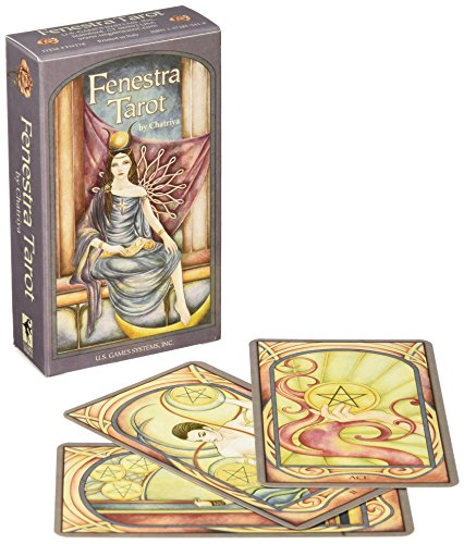
this is one of my personal favourite decks that i use frequently. initially i bought this deck on impulse solely to add to my collection. however when i opened and sat down with the deck i connected with the cards right away. the artwork is simple yet very beautiful with a art deco feel. the symbolism folys the RWS system of reading but is not another clone deck where the images are exactly the same and the colors are just different, the artist really gives the decks its own feel.some things i must emphasize-the back of each card is of intertwined roses and is my favourite card backing design to date-the images are nuetral and are not overly dark nor are they childish and encorage the readers to use intuition-the deck is great for both new and advanced readers-the deck doens't have an intimidation factor where the reader feels overwhelmed by the imagery or distracted the artwork is very softthis is a beautiful deck to have for reading or just to have. i use it to read when i have a friend wanting a relationship reading or just to read and it is one of my most treasured decks along side my deviant moon deck which i bought together with this deck.i highly recomend this deck. for any collector or reader looking for a deck that will inspire youfenestra is latin for 'window' and this deck truly is a window to your inner most self
D**F
Beautifully drawn but hard to read
I like the artistry of the cards, which is what prompted me to buy them. As individual pieces I think they're beautiful and I like using them for 1-card meditative draws. As a whole, the limited palette is dim and autumnal, and as a moody Pisces it puts me in a melancholy sort of state, so I avoid using them for large spreads. I'm also colourblind, and the fact that the colours are so closely matched can it a bit difficult to pick out detail. The images are in 'windows', which makes the image portion of the card smaller, especially in the Majors. For these reasons I only use the deck for myself or family/friends that have time for me to sit and stare with my face close to them to pull the story out...I won't use them for a client.
H**Y
Lack of destaction and more too the point of the cards and what it says to you
I love everything about the cards, I've been looking for deck that I can understand what means without looking at the book.its like the cards picture self explanatory, I've veen searchinng for deck I can connect too and able to understand this is the one .
H**H
A Soothing, Beautiful and Airy Tarot
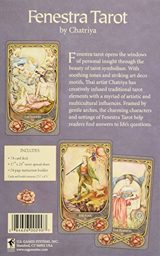
From the box..."Fenestra Tarot opens the windows of personal insight through the beauty of tarot symbolism. With soothing tones and striking art Deco motifs, Thai artist Chatriya has creatively infused traditional tarot elements with a myriad of artistic and multicultural influences. Framed by gentle arches, the charming characters and setting of the Fenestra tarot help readers find answers to life question."I agree with the box! The Fenestra Tarot is beautiful, clear and soothing. With deep pastel hues, soft and flowing artwork and striking people and scenery, the symbolism is full and adheres to the Rider-Waite system. I do feel that some symbols have been omitted to make way for the artistic style but this gives the deck familiarity and yet an open and airy feeling. This is good if you are looking for a deck that allows for more insight. A good deck for a beginner, but not as obvious as the Rider-Waite.The LWB gives keywords for each card. The cards are standard sized thin and fairly glossy and come in their own box, which inserts into the middle of a slip case, and comes with a Celtic Cross Reading sheet in Fenestra style.
J**E
... than my rider pack which felt awkward to feel comfortable with the pack has lovely designs but unfortunately I ...
The cards were very stiff - I found it quite hard to shuffle them- they seemed bigger than my rider pack which felt awkward to feel comfortable with the pack has lovely designs but unfortunately I will re ordering a rider pack - I felt like I was shuffling cardboard - saying that and it needs to be said - the cards were accurate!
B**V
Beautiful Tarot Deck
This deck is beautifully illustrated and very similar to the RW deck, which makes them equally as easy to read as RW , which was my first/ learning deck
L**A
Five Stars
Super!
M**A
Muy Recomendable
El mazo viene contenido en una caja de 18.5cm x 11.5cm x 3cm, contiene una hoja con una guía de lectura de cartas, un librillo de instrucciones y una estructura de cartón donde viene insertada la caja que contiene el mazo, de esta forma queda muy protegido el mazo, los colores y diseño de los arcanos es hermoso y aunque es tradicional tiene el toque personalizado del autor, las cartas son plásticas y ligeramente más gruesas que las tradicionales y son muy fáciles de manejar, el diseño del enmarcado de las imágenes de los arcanos también es muy hermoso, las cartas parecen tener una energía fluida en general pero sin dejar de representar la fuerza contenida en cada arcano respectivamente y el diseño de la contraportada también es muy hermoso. Considero que es muy descriptivo y fácil de interpretar por lo tanto cualquier usuario puede utilizar tanto principiante como avanzado.
Trustpilot
4 days ago
1 month ago