We remain fully operational. Our teams are working around the clock to ensure your deliveries continue safely.

DOWNLOAD THE APP


Customer Services
Copyright © 2025 Desertcart Holdings Limited
DOWNLOAD THE APP

🔮 Unlock timeless wisdom with every shuffle — your classic tarot journey starts here!
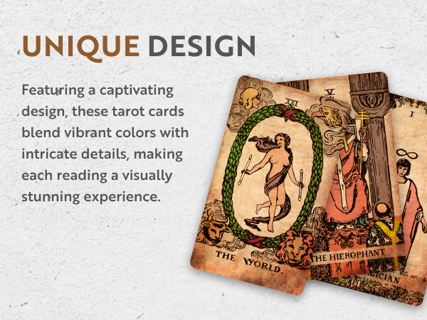
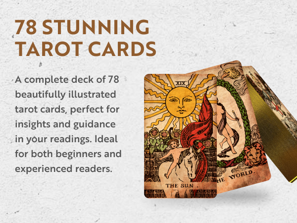
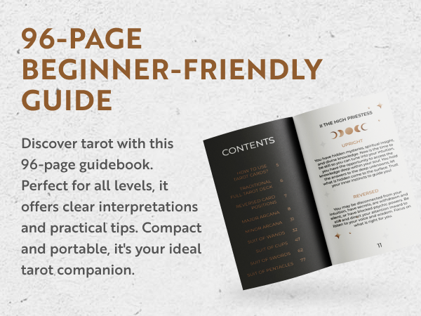
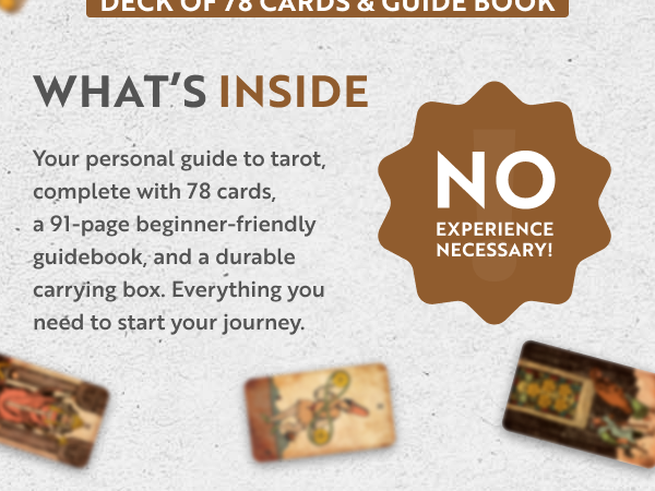
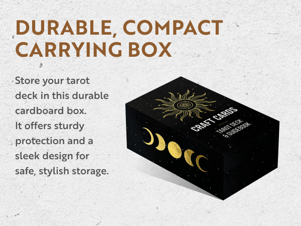
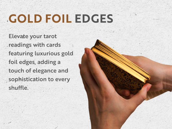
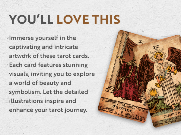
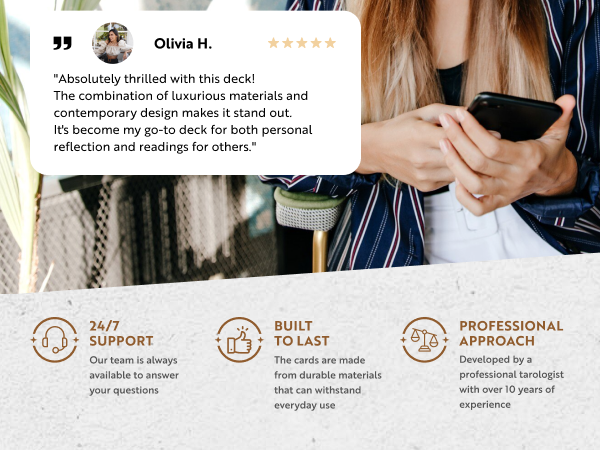
The CRAFTERIAN Classic Tarot Set features 78 gold-edged cards inspired by the traditional Rider-Waite deck, paired with a detailed 91-page guidebook. Crafted with durable cardstock and housed in a sturdy protective box, this medium-sized deck offers a vintage aesthetic and premium quality, making it perfect for beginners and seasoned tarot readers seeking an authentic, elegant divination experience.

| ASIN | B0BX3PZXPC |
| Age Range Description | Kid,Teen,Adult |
| Best Sellers Rank | #26,703 in Toys & Games ( See Top 100 in Toys & Games ) #36 in Fortune Telling Toys |
| Brand Name | CRAFTERIAN |
| Color | Black |
| Customer Reviews | 4.6 out of 5 stars 606 Reviews |
| Educational Objective | Tarot Cards |
| Included Components | Cardboard Box , 91-Page Guidebook |
| Is Assembly Required | No |
| Item Dimensions | 4.72 x 2.72 x 1.57 inches |
| Item Type Name | Tarot Cards |
| Item Weight | 0.7 Pounds |
| Manufacturer | CRAFTERIAN |
| Manufacturer Maximum Age (MONTHS) | 1500.00 |
| Manufacturer Minimum Age (MONTHS) | 2.00 |
| Manufacturer Part Number | 001 |
| Material Type | Cardboard |
| Model Number | 001 |
| Number of Players | 1 |
| Operation Mode | Manual |
| Power Source | Manual |
| Set Name | Classic |
| Size | Medium |
| Subject Character | The Fool |
| Supported Battery Types | No batteries required |
| Theme | Anime |
| UPC | 310267958816 |
| Unit Count | 78 Count |
P**A
Nice deck.
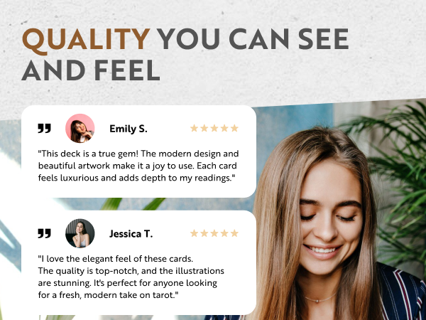
High quality, sturdy cards with a nice gold edging. Look of classic age even though they are new. Nice art work. Comes with a guide book if you need to learn how to read the cards. Come in a sturdy box. Seem thicker than standard playing cards. Should stand up to years of use.
T**D
Great quality tarot deck with gold foil edges😍😍🔥
As a long-time Tarot enthusiast and collector, I am always excited to discover a new deck that resonates with my spirit, and The Enchanted Tarot Deck has done just that. This exquisite tarot deck has become an instant favorite and an essential tool for my daily practice. Not only are the illustrations visually stunning, but they also bring a unique and powerful energy that allows for deep, intuitive readings🔮💗 The moment I received the deck, I was immediately captivated by the elegant packaging. The box itself is sturdy, ensuring that the cards remain protected and secure. The accompanying guidebook is not only insightful but also beautifully designed, with detailed explanations of each card's meaning. As I delved deeper into that Tarot Deck, I found the artwork to be truly mesmerizing. Each card is a work of art, with intricate and vibrant illustrations that capture the essence of the traditional Rider-Waite symbolism while adding a touch of whimsy and mystique. The artist has skillfully combined various vintage styles, and digital techniques, resulting in a breathtaking visual experience that enhances the intuitive process. What I love most about this deck is its accessibility for both beginners and experienced readers alike, also great gold foil edges. The cards are easy to shuffle and handle, thanks to their high-quality, matte finish and sturdy cardstock. The guidebook is comprehensive, providing clear interpretations and guidance for each card, making it an excellent resource for readers of all levels. That Tarot Deck has proven to be a powerful tool for self-discovery and personal growth. Each reading has brought me valuable insights and guidance, as the cards seem to speak directly to my intuition. I have also found that this deck works exceptionally well for meditation and journaling exercises, helping me delve deeper into my subconscious and unlock hidden truths. In conclusion, Vintage Tarot Deck is an absolute treasure for any tarot enthusiast, regardless of their experience level. The combination of stunning artwork, intuitive energy, and user-friendly guidebook makes this deck a valuable addition to any spiritual practice. I wholeheartedly recommend that Tarot Deck to anyone seeking a fresh, captivating, and transformative tarot experience. Whether you are a seasoned reader or just starting your journey into the world of tarot, this deck will undoubtedly become a cherished companion on your path to self-discovery and enlightenment🙌🏻❤️🔥
D**T
Large & Super Flexible !
I cannot say enough about these cards. After I got used to tarot cards at all, (with little ones that came without a guidebook from a different vendor), I got these here. I’m so glad I did. The images are larger, clearer, & are beautiful gold-edged cards. A lot of the large, or full-sized cards like these are not easy to shuffle in the normal way, but these are somehow. They are the perfect balance between strength and flexibility for large, gold edged cards! I also like the fact that the images are the same as the original deck, but the coloring is slightly different, so that it appears in a less overly.. bright way, if you know what I mean. And it was not expensive for great quality like this. It also comes with a guidebook that will give you descriptions of what the cards can mean, and usually mean, and also gives you suggestions for tarot spreads (how to lay the cards out). Extremely happy with this purchase!
W**M
Thick, high-quality cards
They look great, and they are printed on a thick, high-quality paper. Not flimsy at all. If you are going to take the time to clear and attune the deck (at the very least) and learn to use it, you'll want something like this the minimum. Better decks can be found on Etsy, but this is a well-made deck and won't break the bank.
F**L
Beautiful Gold Details, Just Wish the Cards Were Thicker
This is a gorgeous tarot set—the gold edging is especially lovely and makes the deck feel special right out of the box. It’s visually striking and a pleasure to handle during readings. My only real critiques are that the cards feel a bit thinner than I’d prefer, and the artwork on the back could be more refined. Neither is a dealbreaker, but they do keep it from feeling truly premium. Overall, a beautiful deck with great visual appeal, just a few quality details that could be improved.
R**R
Great Tarot Deck
Beautiful desk very much like the first one I ever owned. Good heavy card stock.
A**L
Lovely Deck!
I am very happy with the quality of the cards. The thickness is good, and the gilded edges are lovely. I really love the esthetic of the original RWS illustrations with this updated coloring, and I like the omission of borders around the illustrations. It makes the illustrations pop a bit more to me. How well they work depends entirely on you, but I found that the deck and I quickly bonded and began working well together straight away. Do watch some videos or read up on how to bond with a deck if you aren't already familiar. I believe that you will be very happy with both the cards themselves and how they work with you
N**L
Very nice classic deck
Crafted to look aged, this is the Rider pack. The cards look like someone unearthed them from a couple of hundred years ago but in great shape. They are heavy stock.
Trustpilot
3 weeks ago
2 weeks ago